








Named Areas
Part of the CSS Mastery section of Coddy's HTML journey. Lesson 33 of 43.
Instead of placing items using line numbers, you can give parts of your grid names using the grid-template-areas property. This method is great for creating clean, readable layouts, especially when working with multiple sections like headers, sidebars, and footers. Check out the example below:
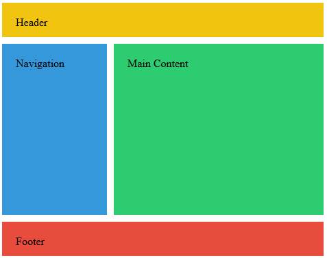
We define a container with CSS Grid and use grid-template-areas to create a named layout:
.container {
  display: grid;
  grid-template-columns: 1fr 1fr 1fr;
  grid-template-rows: auto auto auto;
  grid-template-areas:
    "header header header"
    "sidebar content content"
    "footer footer footer";
}
Each line of text makes a row, and each word in the line is a part of the grid. If you repeat a word, that area will stretch across more space.
Then, you match your HTML elements to those names like this:
.header { grid-area: header; }
.sidebar { grid-area: sidebar; }
.content { grid-area: content; }
.footer { grid-area: footer; }
Challenge
EasyCreate a CSS grid layout for a basic webpage with the following areas like on the picture below:
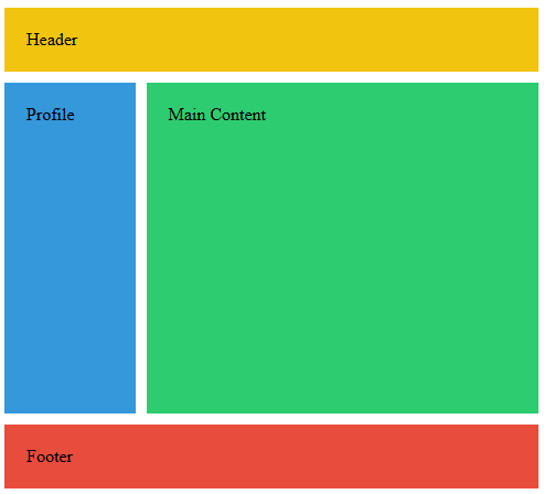
Set the following properties on the .container selector:
displaytogridgrid-template-columnsto1fr 3frgrid-template-rowstoauto 1fr autogrid-template-areasto:"header header""profile main""footer footer"
Assign each element to its respective area. For example, for the .header set grid-area to header.
Try it yourself
<!DOCTYPE html>
<html>
<head>
<style>
.container {
height: 100vh;
gap: 10px;
/* Set up your grid container here */
}
.header {
/* Assign to header area */
background-color: #f1c40f;
padding: 20px;
}
.profile {
/* Assign to profile area */
background-color: #3498db;
padding: 20px;
}
.main {
/* Assign to main area */
background-color: #2ecc71;
padding: 20px;
}
.footer {
/* Assign to footer area */
background-color: #e74c3c;
padding: 20px;
}
</style>
</head>
<body>
<div class="container">
<div class="header">Header</div>
<div class="profile">Profile</div>
<div class="main">Main Content</div>
<div class="footer">Footer</div>
</div>
</body>
</html> Test yourself
This lesson includes a short quiz. Start the lesson to answer it and track your progress.
All lessons in CSS Mastery
1Selector Mastery – Combination
IntroductionDescendant SelectorChild SelectorAdjacent Sibling SelectorGeneral Sibling SelectorRecap ChallengePractice on your own: Web playground