








Grid-row Item Placement
Part of the CSS Mastery section of Coddy's HTML journey. Lesson 32 of 43.
The grid-row property allows you to control where an item is placed vertically in a CSS Grid. It specifies on which row to start and end the item.
Before we dive in, it is important to understand the difference between grid lines and grid tracks.
Grid lines are the dividing lines (numbered 1, 2, 3, etc.) that make up the grid structure. A grid track is the space between two adjacent grid lines: essentially, the row or column itself.
Let's say we have a simple container with 8 items, and we want the first item to span from row line 1 to row line 4 in the grid:
.item1 {
  grid-row: 1 / 4;
}
This is how it looks:
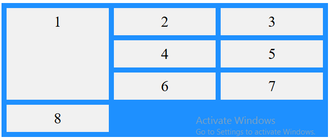
To span across multiple rows, you can also use the span keyword:
.item2 {
  grid-row: 2 / span 2;
  background-color: lightpink;
}
This places item2 starting at row line 2 and spanning across 2 rows (or 2 tracks).

Challenge
EasyUse the grid-row property to make the fourth grid item span from row line 2 to row line 4.
Try it yourself
<!DOCTYPE html>
<html>
<head>
<style>
.grid-container {
  display: grid;
  grid-template-columns: auto auto auto;
  gap: 10px;
  background-color: dodgerblue;
  padding: 10px;
}

.grid-container > div {
  background-color: #f1f1f1;
  text-align: center;
  padding: 10px;
  font-size: 30px;
}
/* Add your CSS styles here */

</style>
</head>
<body>
<div class="grid-container">
  <div class="item1">1</div>
  <div class="item2">2</div>
  <div class="item3">3</div>
  <div class="item4">4</div>
  <div class="item5">5</div>
  <div class="item6">6</div>
  <div class="item7">7</div>
  <div class="item8">8</div>
</div>

</body>
</html>
 Test yourself
This lesson includes a short quiz. Start the lesson to answer it and track your progress.
All lessons in CSS Mastery
1Selector Mastery – Combination
IntroductionDescendant SelectorChild SelectorAdjacent Sibling SelectorGeneral Sibling SelectorRecap ChallengePractice on your own: Web playground