








Recap Challenge
Part of the CSS Mastery section of Coddy's HTML journey. Lesson 34 of 43.

Challenge
EasyUse CSS Grid to build a clean layout with a header and a 3-image gallery in one row like on the image below:
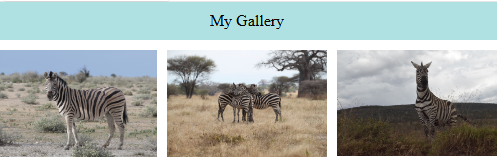
- Set
.containertodisplay: gridand add agapbetween items. - Create a grid with 2 rows and 3 columns.
Define grid areas using:
grid-template-areas: "header header header" "img1 img2 img3";- Assign each grid item to its area using the
grid-areaproperty.
Try it yourself
<!DOCTYPE html>
<html>
<head>
  <style>
    body{
        margin: 0;
        padding: 0;
    }
    img{
        width: 100%;
    }
    .header{
        text-align: center;
        padding: 10px;
        background-color: #afe1e3;
    }
    /* Add you CSS code here */

  </style>
</head>
<body>
  <div class="container">
    <div class="header">My Gallery</div>
    <div class="img1"><img src="https://upload.wikimedia.org/wikipedia/commons/1/1b/Burchell%27s_zebra_%28Equus_quagga_burchellii%29_2.jpg"></div>
    <div class="img2"><img src="https://upload.wikimedia.org/wikipedia/commons/3/39/Zebra_zebras_-_tarangire_tanzania_africa.jpg"></div>
    <div class="img3"><img src="https://upload.wikimedia.org/wikipedia/commons/1/11/Zebra-Lake_Nakuru.jpg"></div>
</div>
</body>
</html>
All lessons in CSS Mastery
1Selector Mastery – Combination
IntroductionDescendant SelectorChild SelectorAdjacent Sibling SelectorGeneral Sibling SelectorRecap ChallengePractice on your own: Web playground