








요약 챌린지
Coddy HTML 여정의 실전 프론트엔드 섹션에 포함된 레슨. 35개 중 25번째.

챌린지
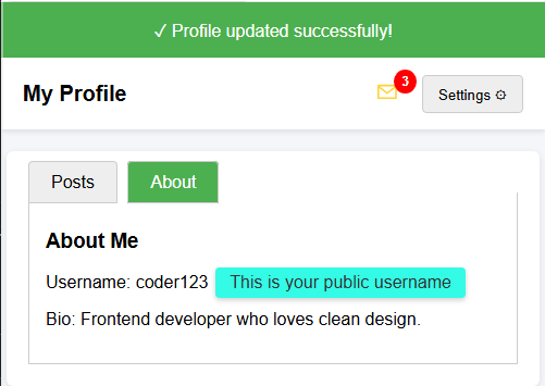
쉬움다양한 UI 컴포넌트(드롭다운 메뉴, 탭, 배지, 툴팁, 알림 배너)가 포함된 HTML 페이지가 제공됩니다.
여러분의 작업은 모든 것이 올바르게 보이고 작동하도록 CSS를 완성하는 것입니다.
작업 내용:
- 알림 배너를 초록색 배경(rgb(76, 175, 80))과 흰색 텍스트로 스타일링하세요.
- 메시지 아이콘의 오른쪽 상단 모서리에 배지를 배치하세요(
position: absolute,top,right를 사용하세요). - 드롭다운 메뉴를 기본적으로 숨기세요.
- 탭에 사용되는 라디오 입력을 숨기세요.
- 툴팁에 배경색, 둥근 모서리, 패딩을 적용하여 스타일링하세요.
최종 결과는 아래 그림과 같아야 합니다.
직접 해보기
<!DOCTYPE html>
<html>
<head>
  <title>Recap Challenge</title>
  <style>
    body {
      font-family: Arial, sans-serif;
      background: #f4f6f9;
      margin: 0;
      padding: 0;
    }

    /* Notification Banner */
    .notification {
      display: flex;
      align-items: center;
      justify-content: center;
      padding: 15px;
      font-size: 16px;
    }

    /* Profile Header */
    .header {
      display: flex;
      justify-content: space-between;
      align-items: center;
      background: white;
      padding: 15px 20px;
      box-shadow: 0 2px 5px rgba(0,0,0,0.1);
    }

    .header h1 {
      margin: 0;
      font-size: 20px;
    }

    /* Dropdown */
    .dropdown {
      position: relative;
      display: inline-block;
    }

    .dropdown-button {
      padding: 8px 14px;
      background: #eee;
      border: 1px solid #ccc;
      cursor: pointer;
      border-radius: 4px;
    }

    .dropdown-content {
      position: absolute;
      right: 0;
      background: white;
      box-shadow: 0 2px 6px rgba(0,0,0,0.2);
      border-radius: 4px;
      margin-top: 5px;
      min-width: 150px;
      z-index: 10;
    }

    .dropdown-content a {
      display: block;
      padding: 10px;
      text-decoration: none;
      color: #333;
    }

    .dropdown-content a:hover {
      background: #f2f2f2;
    }

    .dropdown:hover .dropdown-content {
      display: block;
    }

    /* Tabs */
    .tabs {
      margin: 20px;
      background: white;
      border-radius: 6px;
      box-shadow: 0 2px 6px rgba(0,0,0,0.1);
      padding: 20px;
      width: 90%;
      max-width: 600px;
      margin-left: auto;
      margin-right: auto;
    }

    .tabs label {
      padding: 10px 20px;
      cursor: pointer;
      background: #eee;
      border: 1px solid #ccc;
      margin-right: 5px;
      border-radius: 4px 4px 0 0;
    }

    .tabs label:hover {
      background: #ddd;
    }

    .tab-content {
      display: none;
      border: 1px solid #ccc;
      border-top: none;
      padding: 15px;
      background: white;
    }

    #tab1:checked ~ #content1,
    #tab2:checked ~ #content2 {
      display: block;
    }

    #tab1:checked + label,
    #tab2:checked + label {
      background: #4CAF50;
      color: white;
    }

    /* Badge */
    .icon {
      position: relative;
      font-size: 22px;
      margin-right: 15px;
    }

    .badge {
      background: red;
      color: white;
      font-size: 12px;
      font-weight: bold;
      padding: 4px 7px;
      border-radius: 50%;
    }

    /* Tooltip */
    .tooltip {
      position: relative;
      display: inline-block;
      cursor: pointer;
    }

    .tooltip .tooltip-text {
      visibility: hidden;
      width: 160px;
      color: #333;
      text-align: center;
      position: absolute;
      left: 110%;
      top: 50%;
      transform: translateY(-50%);
      white-space: nowrap;
      box-shadow: 0 2px 5px rgba(0,0,0,0.2);
    }

    .tooltip:hover .tooltip-text {
      visibility: visible;
    }
  </style>
</head>
<body>

  <!-- 알림 배너 -->
  <div class="notification">
    ✓ Profile updated successfully!
  </div>

  <!-- 헤더 -->
  <div class="header">
    <h1>My Profile</h1>
    <div>
      <span class="icon">✉ <span class="badge">3</span></span>
      <div class="dropdown">
        <button class="dropdown-button">Settings ⚙️</button>
        <div class="dropdown-content">
          <a href="#">Edit Profile</a>
          <a href="#">Account</a>
          <a href="#">Logout</a>
        </div>
      </div>
    </div>
  </div>

  <!-- 탭 -->
  <div class="tabs">
    <input type="radio" id="tab1" name="tab" checked>
    <label for="tab1">Posts</label>
    <input type="radio" id="tab2" name="tab">
    <label for="tab2">About</label>

    <div id="content1" class="tab-content">
      <h3>Recent Posts</h3>
      <p>Here are your latest posts.</p>
    </div>
    <div id="content2" class="tab-content">
      <h3>About Me</h3>
      <p>Username: <span class="tooltip">coder123
        <span class="tooltip-text">This is your public username</span>
      </span></p>
      <p>Bio: Frontend developer who loves clean design.</p>
    </div>
  </div>

</body>
</html>
실전 프론트엔드의 모든 레슨
직접 연습해 보세요: Web 플레이그라운드