








Défi récapitulatif
Fait partie de la section Front-end pratique du Journey HTML de Coddy. Leçon 25 sur 35.

Défi
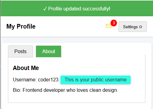
FacileUne page HTML avec différents composants d’interface utilisateur (menu déroulant, onglets, badge, infobulle et bannière de notification) vous est fournie.
Votre tâche consiste à compléter le CSS afin que tout s’affiche et fonctionne correctement.
Votre tâche :
- Styliser la bannière de notification avec un arrière-plan vert (rgb(76, 175, 80)) et du texte blanc.
- Positionner le badge dans le coin supérieur droit de l’icône de message (utilisez
position: absolute,topetright). - Masquer le menu déroulant par défaut.
- Masquer les boutons radio utilisés pour les onglets.
- Styliser l’infobulle avec une couleur d’arrière-plan, des coins arrondis et du remplissage.
Le résultat final devrait ressembler à l’image ci-dessous.
Essayez vous-même
<!DOCTYPE html>
<html>
<head>
  <title>Recap Challenge</title>
  <style>
    body {
      font-family: Arial, sans-serif;
      background: #f4f6f9;
      margin: 0;
      padding: 0;
    }

    /* Notification Banner */
    .notification {
      display: flex;
      align-items: center;
      justify-content: center;
      padding: 15px;
      font-size: 16px;
    }

    /* Profile Header */
    .header {
      display: flex;
      justify-content: space-between;
      align-items: center;
      background: white;
      padding: 15px 20px;
      box-shadow: 0 2px 5px rgba(0,0,0,0.1);
    }

    .header h1 {
      margin: 0;
      font-size: 20px;
    }

    /* Dropdown */
    .dropdown {
      position: relative;
      display: inline-block;
    }

    .dropdown-button {
      padding: 8px 14px;
      background: #eee;
      border: 1px solid #ccc;
      cursor: pointer;
      border-radius: 4px;
    }

    .dropdown-content {
      position: absolute;
      right: 0;
      background: white;
      box-shadow: 0 2px 6px rgba(0,0,0,0.2);
      border-radius: 4px;
      margin-top: 5px;
      min-width: 150px;
      z-index: 10;
    }

    .dropdown-content a {
      display: block;
      padding: 10px;
      text-decoration: none;
      color: #333;
    }

    .dropdown-content a:hover {
      background: #f2f2f2;
    }

    .dropdown:hover .dropdown-content {
      display: block;
    }

    /* Tabs */
    .tabs {
      margin: 20px;
      background: white;
      border-radius: 6px;
      box-shadow: 0 2px 6px rgba(0,0,0,0.1);
      padding: 20px;
      width: 90%;
      max-width: 600px;
      margin-left: auto;
      margin-right: auto;
    }

    .tabs label {
      padding: 10px 20px;
      cursor: pointer;
      background: #eee;
      border: 1px solid #ccc;
      margin-right: 5px;
      border-radius: 4px 4px 0 0;
    }

    .tabs label:hover {
      background: #ddd;
    }

    .tab-content {
      display: none;
      border: 1px solid #ccc;
      border-top: none;
      padding: 15px;
      background: white;
    }

    #tab1:checked ~ #content1,
    #tab2:checked ~ #content2 {
      display: block;
    }

    #tab1:checked + label,
    #tab2:checked + label {
      background: #4CAF50;
      color: white;
    }

    /* Badge */
    .icon {
      position: relative;
      font-size: 22px;
      margin-right: 15px;
    }

    .badge {
      background: red;
      color: white;
      font-size: 12px;
      font-weight: bold;
      padding: 4px 7px;
      border-radius: 50%;
    }

    /* Tooltip */
    .tooltip {
      position: relative;
      display: inline-block;
      cursor: pointer;
    }

    .tooltip .tooltip-text {
      visibility: hidden;
      width: 160px;
      color: #333;
      text-align: center;
      position: absolute;
      left: 110%;
      top: 50%;
      transform: translateY(-50%);
      white-space: nowrap;
      box-shadow: 0 2px 5px rgba(0,0,0,0.2);
    }

    .tooltip:hover .tooltip-text {
      visibility: visible;
    }
  </style>
</head>
<body>

  <!-- Bannière de notification -->
  <div class="notification">
    ✓ Profile updated successfully!
  </div>

  <!-- En-tête -->
  <div class="header">
    <h1>My Profile</h1>
    <div>
      <span class="icon">✉ <span class="badge">3</span></span>
      <div class="dropdown">
        <button class="dropdown-button">Settings ⚙️</button>
        <div class="dropdown-content">
          <a href="#">Edit Profile</a>
          <a href="#">Account</a>
          <a href="#">Logout</a>
        </div>
      </div>
    </div>
  </div>

  <!-- Onglets -->
  <div class="tabs">
    <input type="radio" id="tab1" name="tab" checked>
    <label for="tab1">Posts</label>
    <input type="radio" id="tab2" name="tab">
    <label for="tab2">About</label>

    <div id="content1" class="tab-content">
      <h3>Recent Posts</h3>
      <p>Here are your latest posts.</p>
    </div>
    <div id="content2" class="tab-content">
      <h3>About Me</h3>
      <p>Username: <span class="tooltip">coder123
        <span class="tooltip-text">This is your public username</span>
      </span></p>
      <p>Bio: Frontend developer who loves clean design.</p>
    </div>
  </div>

</body>
</html>
Toutes les leçons de Front-end pratique
Entraînez-vous par vous-même : Playground Web