








Recap Challenge
Part of the Practical Frontend section of Coddy's HTML journey. Lesson 25 of 35.

Challenge
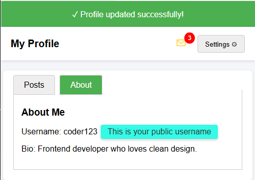
EasyYou are given an HTML page with different UI components (dropdown menu, tabs, badge, tooltip, and a notification banner).
Your task is to complete the CSS so that everything looks and works properly.
Your task:
- Style the notification banner with a green background (rgb(76, 175, 80)) and white text.
- Position the badge in the top-right corner of the message icon (use
position: absolute,top, andright). - Hide the dropdown menu by default.
- Hide the radio inputs used for the tabs.
- Style the tooltip with a background color, rounded corners, and padding.
The final result should look like the picture below.
Try it yourself
<!DOCTYPE html>
<html>
<head>
  <title>Recap Challenge</title>
  <style>
    body {
      font-family: Arial, sans-serif;
      background: #f4f6f9;
      margin: 0;
      padding: 0;
    }

    /* Notification Banner */
    .notification {
      display: flex;
      align-items: center;
      justify-content: center;
      padding: 15px;
      font-size: 16px;
    }

    /* Profile Header */
    .header {
      display: flex;
      justify-content: space-between;
      align-items: center;
      background: white;
      padding: 15px 20px;
      box-shadow: 0 2px 5px rgba(0,0,0,0.1);
    }

    .header h1 {
      margin: 0;
      font-size: 20px;
    }

    /* Dropdown */
    .dropdown {
      position: relative;
      display: inline-block;
    }

    .dropdown-button {
      padding: 8px 14px;
      background: #eee;
      border: 1px solid #ccc;
      cursor: pointer;
      border-radius: 4px;
    }

    .dropdown-content {
      position: absolute;
      right: 0;
      background: white;
      box-shadow: 0 2px 6px rgba(0,0,0,0.2);
      border-radius: 4px;
      margin-top: 5px;
      min-width: 150px;
      z-index: 10;
    }

    .dropdown-content a {
      display: block;
      padding: 10px;
      text-decoration: none;
      color: #333;
    }

    .dropdown-content a:hover {
      background: #f2f2f2;
    }

    .dropdown:hover .dropdown-content {
      display: block;
    }

    /* Tabs */
    .tabs {
      margin: 20px;
      background: white;
      border-radius: 6px;
      box-shadow: 0 2px 6px rgba(0,0,0,0.1);
      padding: 20px;
      width: 90%;
      max-width: 600px;
      margin-left: auto;
      margin-right: auto;
    }

    .tabs label {
      padding: 10px 20px;
      cursor: pointer;
      background: #eee;
      border: 1px solid #ccc;
      margin-right: 5px;
      border-radius: 4px 4px 0 0;
    }

    .tabs label:hover {
      background: #ddd;
    }

    .tab-content {
      display: none;
      border: 1px solid #ccc;
      border-top: none;
      padding: 15px;
      background: white;
    }

    #tab1:checked ~ #content1,
    #tab2:checked ~ #content2 {
      display: block;
    }

    #tab1:checked + label,
    #tab2:checked + label {
      background: #4CAF50;
      color: white;
    }

    /* Badge */
    .icon {
      position: relative;
      font-size: 22px;
      margin-right: 15px;
    }

    .badge {
      background: red;
      color: white;
      font-size: 12px;
      font-weight: bold;
      padding: 4px 7px;
      border-radius: 50%;
    }

    /* Tooltip */
    .tooltip {
      position: relative;
      display: inline-block;
      cursor: pointer;
    }

    .tooltip .tooltip-text {
      visibility: hidden;
      width: 160px;
      color: #333;
      text-align: center;
      position: absolute;
      left: 110%;
      top: 50%;
      transform: translateY(-50%);
      white-space: nowrap;
      box-shadow: 0 2px 5px rgba(0,0,0,0.2);
    }

    .tooltip:hover .tooltip-text {
      visibility: visible;
    }
  </style>
</head>
<body>

  <!-- Notification Banner -->
  <div class="notification">
    ✓ Profile updated successfully!
  </div>

  <!-- Header -->
  <div class="header">
    <h1>My Profile</h1>
    <div>
      <span class="icon">✉ <span class="badge">3</span></span>
      <div class="dropdown">
        <button class="dropdown-button">Settings ⚙️</button>
        <div class="dropdown-content">
          <a href="#">Edit Profile</a>
          <a href="#">Account</a>
          <a href="#">Logout</a>
        </div>
      </div>
    </div>
  </div>

  <!-- Tabs -->
  <div class="tabs">
    <input type="radio" id="tab1" name="tab" checked>
    <label for="tab1">Posts</label>
    <input type="radio" id="tab2" name="tab">
    <label for="tab2">About</label>

    <div id="content1" class="tab-content">
      <h3>Recent Posts</h3>
      <p>Here are your latest posts.</p>
    </div>
    <div id="content2" class="tab-content">
      <h3>About Me</h3>
      <p>Username: <span class="tooltip">coder123
        <span class="tooltip-text">This is your public username</span>
      </span></p>
      <p>Bio: Frontend developer who loves clean design.</p>
    </div>
  </div>

</body>
</html>
All lessons in Practical Frontend
Practice on your own: Web playground