








復習チャレンジ
CoddyのHTMLジャーニー「CSSマスタリー」セクションの一部。レッスン 34/43。

チャレンジ
簡単CSS Gridを使用して、下の画像のようにヘッダーと1行に3枚の画像が並ぶギャラリーを持つクリーンなレイアウトを作成してください:
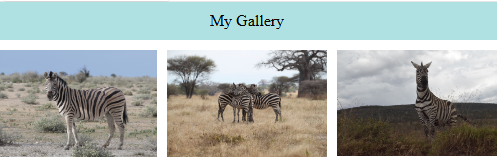
.containerをdisplay: gridに設定し、アイテム間にgapを追加します。- 2行と3列のグリッドを作成します。
次を使用してグリッドエリアを定義します:
grid-template-areas: "header header header" "img1 img2 img3";grid-areaプロパティを使用して、各グリッドアイテムをそのエリアに割り当てます。
自分で試してみよう
<!DOCTYPE html>
<html>
<head>
  <style>
    body{
        margin: 0;
        padding: 0;
    }
    img{
        width: 100%;
    }
    .header{
        text-align: center;
        padding: 10px;
        background-color: #afe1e3;
    }
    /* Add you CSS code here */

  </style>
</head>
<body>
  <div class="container">
    <div class="header">My Gallery</div>
    <div class="img1"><img src="https://upload.wikimedia.org/wikipedia/commons/1/1b/Burchell%27s_zebra_%28Equus_quagga_burchellii%29_2.jpg"></div>
    <div class="img2"><img src="https://upload.wikimedia.org/wikipedia/commons/3/39/Zebra_zebras_-_tarangire_tanzania_africa.jpg"></div>
    <div class="img3"><img src="https://upload.wikimedia.org/wikipedia/commons/1/11/Zebra-Lake_Nakuru.jpg"></div>
</div>
</body>
</html>
CSSマスタリーのすべてのレッスン
自分で練習してみよう: Webプレイグラウンド