








Flex Box Challenge
Part of the Styling with CSS section of Coddy's HTML journey. Lesson 49 of 76.

Challenge
EasyNow that you've mastered the fundamentals of Flexbox, including display: flex;, flex-direction, justify-content, and align-items, it's time to put your knowledge to the test with a comprehensive challenge. This challenge will help you solidify your understanding of how to use these properties together to create flexible and responsive layouts. You'll apply what you've learned about each property to recreate a specific design.
You are given an HTML document with a parent division (<div>) that contains four child divisions (<div>). Your task is to use the Flexbox properties you've learned to style these elements to match the design shown in the image below:
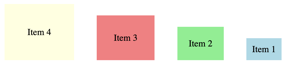
Follow the steps below:
- Write a CSS rule that targets the
<div>element with the classcontainer. - Set the
displayproperty of the.containerelement toflexto turn it into a flex container. - Set the
flex-directionproperty of the.containerelement torow-reverseto arrange the flex items in a row from right to left. - Set the
justify-contentproperty of the.containerelement tospace-betweento distribute the flex items evenly with space between them. - Set the
align-itemsproperty of the.containerelement toflex-endto align the flex items at the end of the cross axis. - Write CSS rules to style the individual flex items (
item1,item2,item3,item4) with different background colors and sizes (using different paddings) as shown in the image.
Try it yourself
<html>
<head>
    <title>Flex Box Challenge</title>
    <style>
        /* Write CSS rules here */
    </style>
</head>
<body>
    <div class="container">
        <div class="item1">Item 1</div>
        <div class="item2">Item 2</div>
        <div class="item3">Item 3</div>
        <div class="item4">Item 4</div>
    </div>
</body>
</html>All lessons in Styling with CSS

5 Colors and Backgrounds
Background ColorHEX ColorsRGB ColorsTransparency with RGBARecap Challenge #1Practice on your own: Web playground